Cat Memorial Portrait Ideas That Feel Like a Tribute
Memorial art is not decorative art. The aim is not a more glamorous cat; it is the cat you remember, still recognisable, in a picture you can live with for years.
Ces guides sont pour l’instant en anglais. L’interface est traduite en premier, les articles suivent.
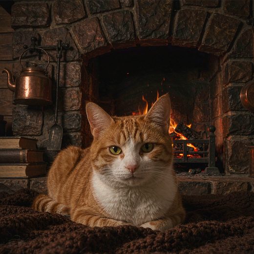
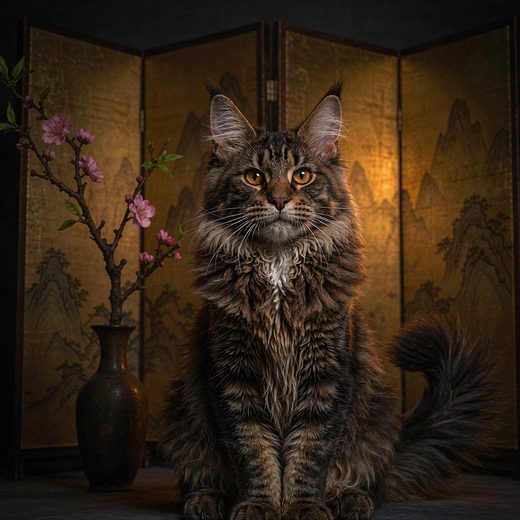
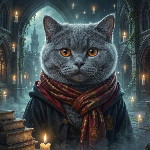
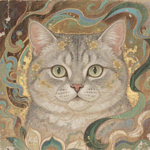
Most memorial portraits go wrong in the same direction: they try too hard. Wings, halos, a rainbow bridge, a sunset, four lines of poetry, and a heavily stylised face that no longer reads as the animal. The intent is affectionate, but the result asks the viewer to look past the decoration to find the cat — and that is the wrong trade for a tribute.
Choose a photo for recognition, not for beauty
The best memorial images are rarely the most polished ones. They are the ones that feel immediately familiar: the ordinary expression, the angle you saw every day, the way they held their head when they wanted something. Imperfection is not a problem here. A slightly soft photo of the right moment carries more of the animal than a sharp photo of a moment that was never really them.
- An everyday expression rather than a posed one. The look from the end of the sofa is usually the one people miss.
- Eye level, if you have it. Looking up at a cat reads as company; looking down reads as documentation.
- Any age. A photo from their last year is as valid as one from their first — sometimes more so.
- The face in focus. Scans of old prints are fine, as long as the eyes are readable.
Softer media age better than dramatic ones
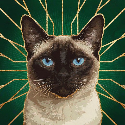
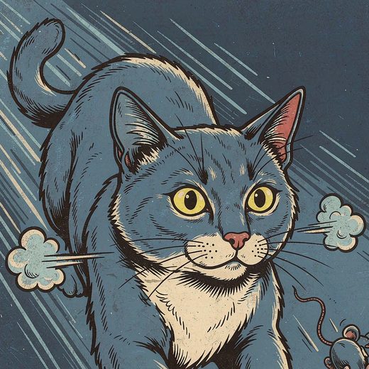
A memorial portrait has to survive being looked at on a bad day, for years. That favours restraint: transparent watercolour, a quiet studio portrait, muted colour. Saturated fantasy treatments and heavy effects are striking for a week and tiring for a decade, and they tend to override the coat pattern — the part most tied to memory.
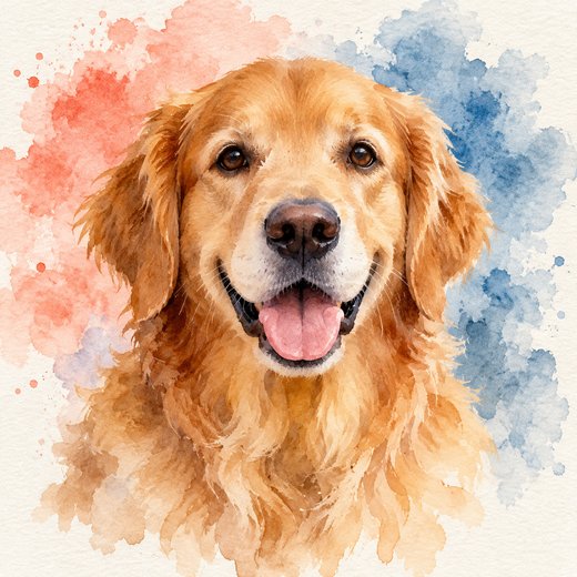
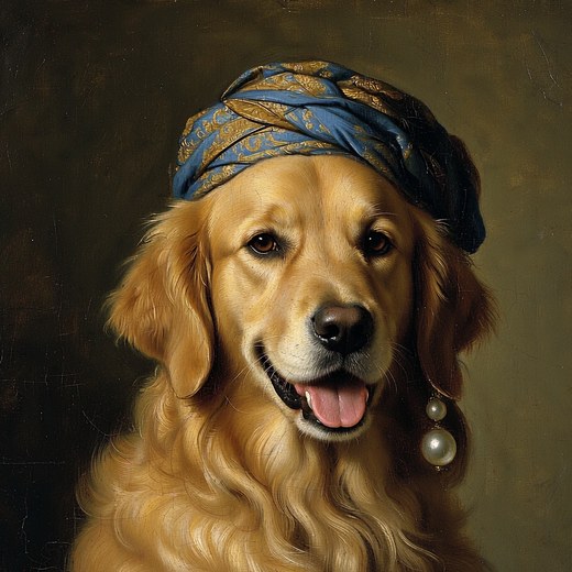
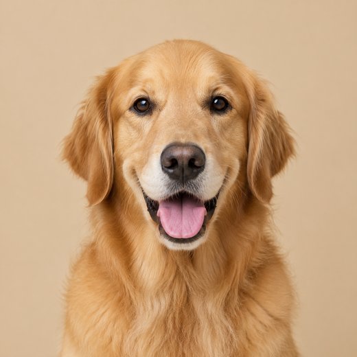
If you want one symbolic element, give it a small job rather than the lead. A paw print pressed into the corner of a frame, a single sprig of flowers, a small date on the mat — quiet enough to be discovered rather than announced.
What quietly turns a tribute into a prop
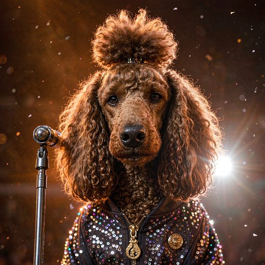
- A costume. A cat in a crown is a charming gift for a living cat; in a memorial it competes with the face.
- A halo, wings or a rainbow bridge used as the main subject. Comforting for some people and too literal for others — and it dates the image to a particular idiom.
- Too much text. A name, or a name and two dates, is enough. Longer inscriptions make the picture hard to look at and harder to hang.
- A style so strong the cat has to be searched for. If the first reaction is 'what a beautiful painting' rather than 'that's Miso', the balance is off.
Size, frame, and where it goes
One portrait, not a collage. A single image at 8×10 or 11×14 inches is easier to live with than a grid of nine, and it keeps the face large enough to recognise from across a room. A 4K file prints at 16×20 inches without upscaling if you want something more substantial.
Placement matters more than people expect. A hallway or a shelf you pass daily tends to feel warmer than a formal wall; a bedroom can be too much for some people and exactly right for others. There is no correct answer — but it is worth deciding before you choose the size.
A note on timing
There is no deadline, and no right week. Some people make the portrait the day after; others wait a year and are glad they did. Nor do you need a perfect photograph — an old scan, a screenshot, a picture with half the sofa in it will do, as long as the face is readable. What you are keeping is the expression, not the resolution.
Questions fréquentes
Which style works best for a memorial portrait?
Usually the quietest one that still preserves the coat pattern: watercolour first, then a plain studio portrait, then classical oil. Very graphic or highly saturated styles tend to pull attention away from the face.
Should I add the cat's name and dates?
If it helps you, yes — but put it on the frame or the mat rather than inside the image. Text inside the picture cannot be removed later, and it makes the print much harder to resize.
Can you work from a phone photo or an old scan?
Yes. What matters is that the eyes and the markings are readable. A soft or grainy source produces a softer portrait; the style cannot invent detail that is not in the file.